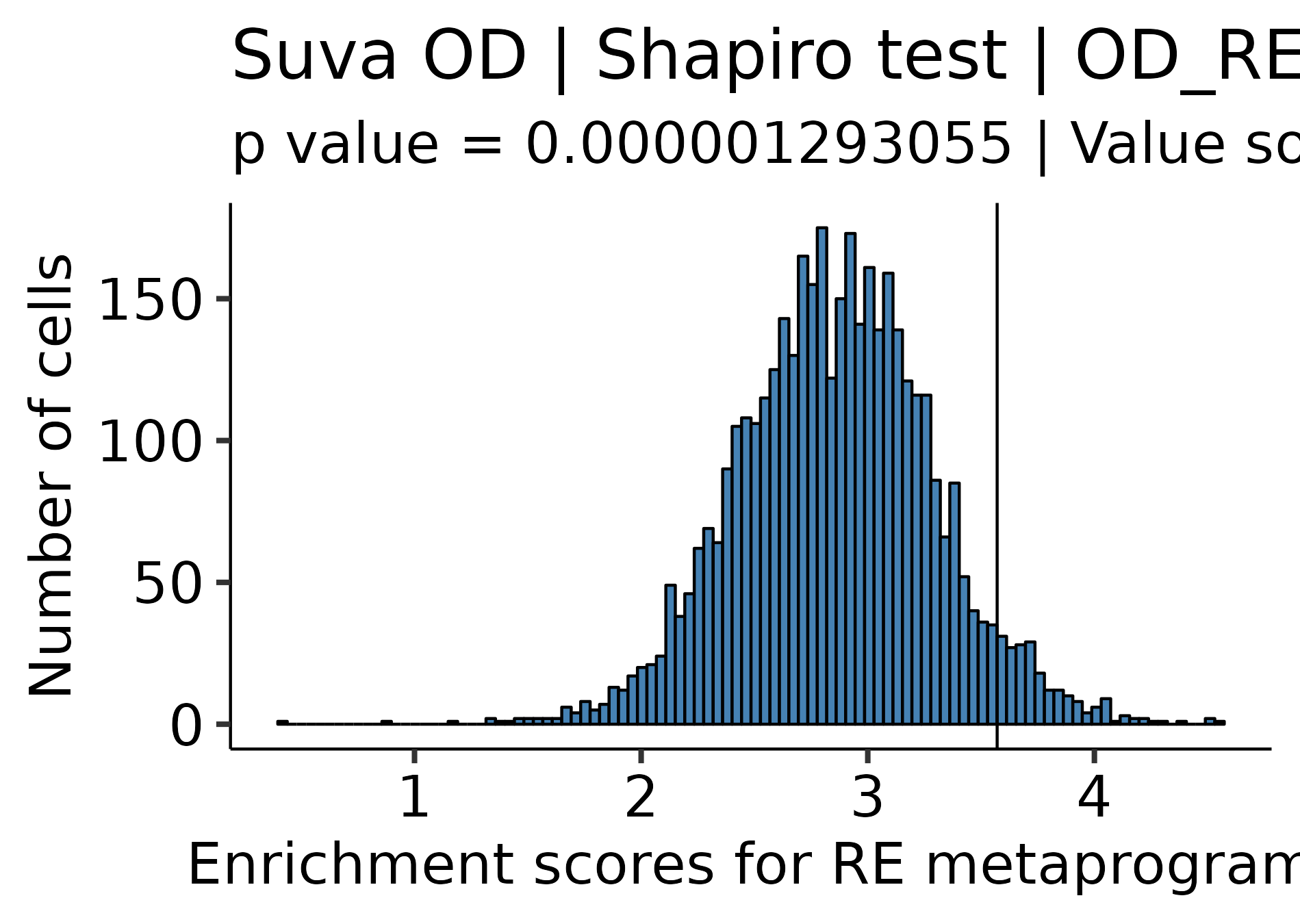
# Enrique Blanco Carmona# e.blancocarmona@kitz-heidelberg.de# PhD Student – Clinical Bioinformatics# Division of Pediatric Neurooncology (B062)# DKFZ-KiTZ | Germanysample<-readRDS("/omics/odcf/analysis/OE0145_projects/idh_gliomas/Figures_Science/revision/IDH_gliomas_book/datasets/suva_OD_TB_integrated.rds")markers<-readRDS("/omics/odcf/analysis/OE0145_projects/idh_gliomas/Figures_Science/revision/IDH_gliomas_book/datasets/IDH_gliomas_TB_annotation_kit_with_Suva_programs_and_metaprogram_iterations.rds")markers.use<-markers[c("OD_RA", "OD_OPC_like", "OD_Astro_like", "OD_Cycling", "Suva_Astro_Program", "Suva_Oligo_Program", "Suva_Stemness_Program")]cluster_cols<-c("Stem-like"="#ECA809","OPC-like"="#043362", "Astro-like"="#9A031E")annotation_cols<-SCpubr:::generate_color_scale(names_use =c("RA", "0", "1", "2", "3", "4", "5", "6", "7"))annotation_cols["RA"]<-"#ECA809"sample<-SCpubr:::compute_enrichment_scores(sample, input_gene_list =list("OD_RA"=markers$OD_RA))# Get the value for which the probabilty to find a more extreme value is 5%.dist.test<-sample@meta.data[, "OD_RA", drop =FALSE]range.use<-c(min(dist.test$OD_RA, na.rm =TRUE),max(dist.test$OD_RA, na.rm =TRUE))df.probs<-data.frame(row.names =seq(range.use[1], range.use[2], by =0.0001))vector.probs<-c()for(iinrownames(df.probs)){prob<-pnorm(as.numeric(i), mean =mean(dist.test$OD_RA), sd =stats::sd(dist.test$OD_RA), lower.tail =FALSE)vector.probs<-c(vector.probs, prob)}df.probs$Prob<-vector.probsvalue.use<-df.probs%>%dplyr::filter(.data$Prob<=0.05)%>%head(1)%>%rownames()%>%as.numeric()# Define RA population based on this value.sample$Annotation<-as.character(sample$seurat_clusters)sample$Annotation[names(sample$Annotation)%in%names(sample$OD_RA[sample$OD_RA>=value.use])]<-"RA"
Code
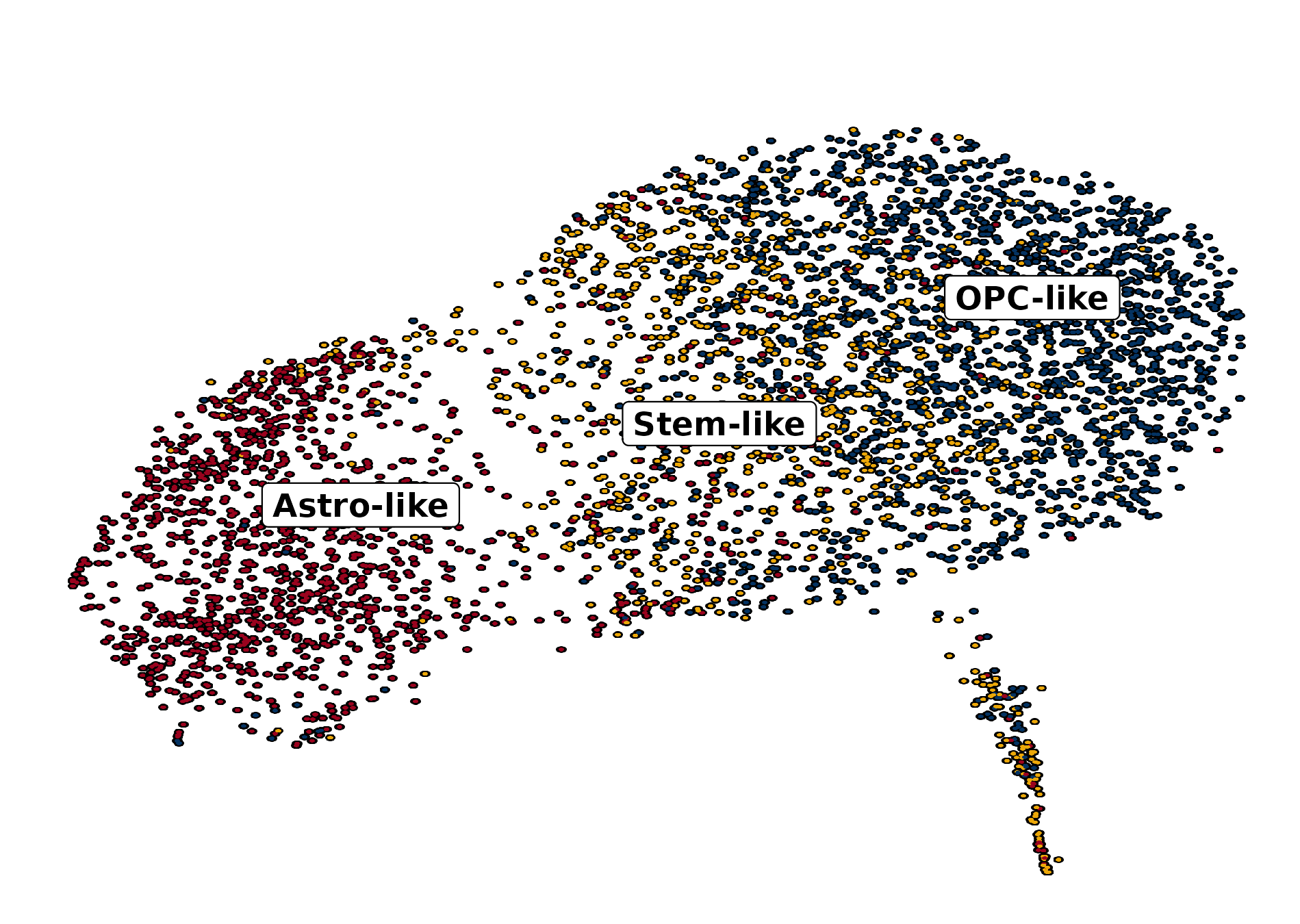
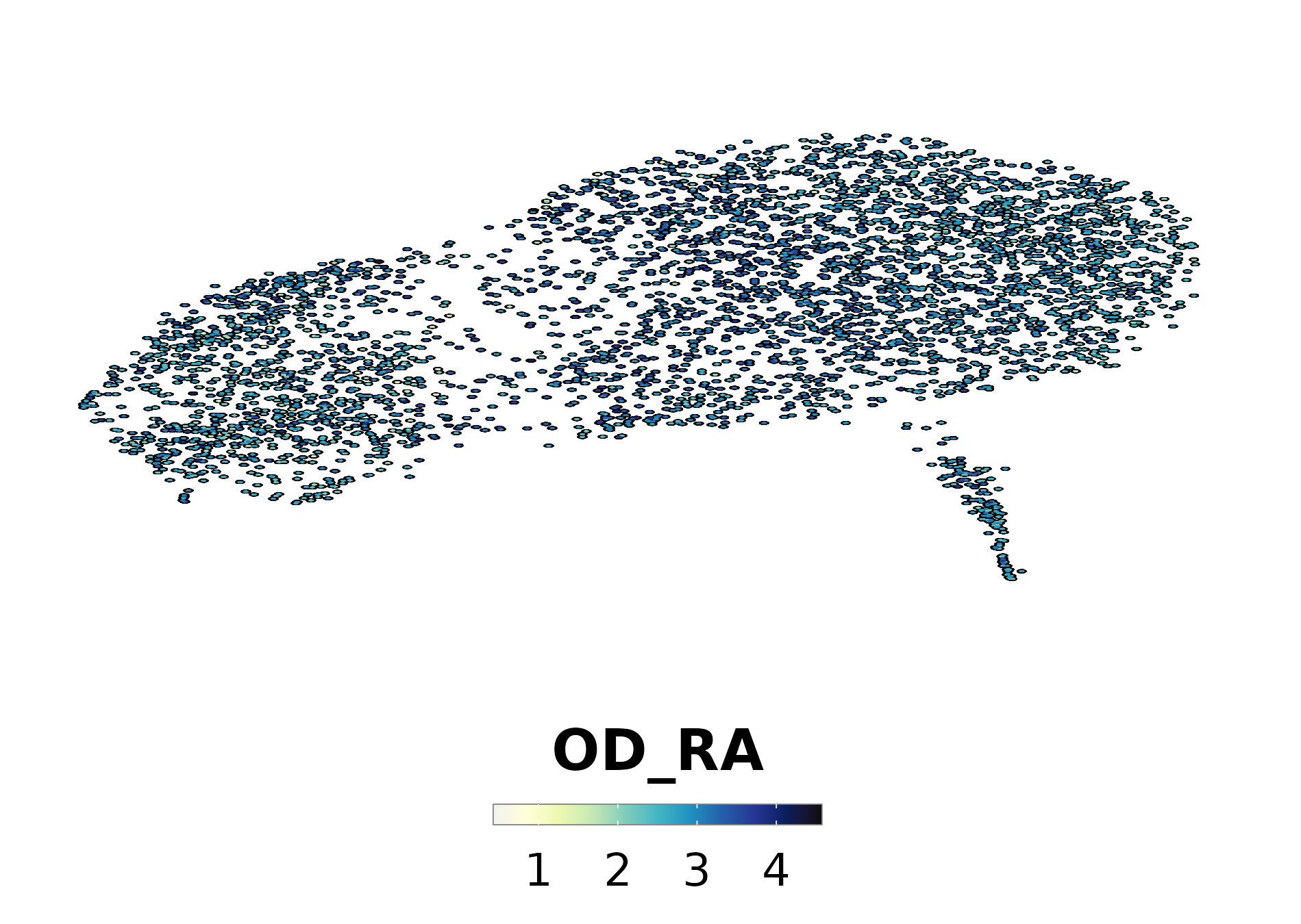
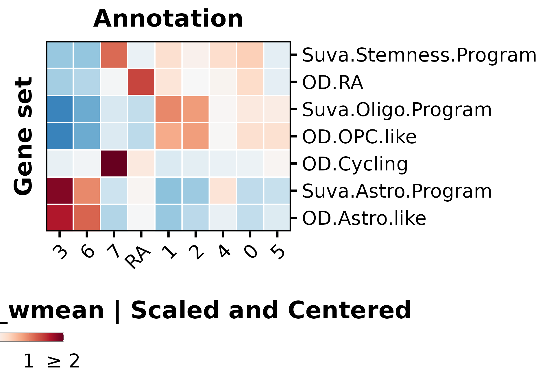
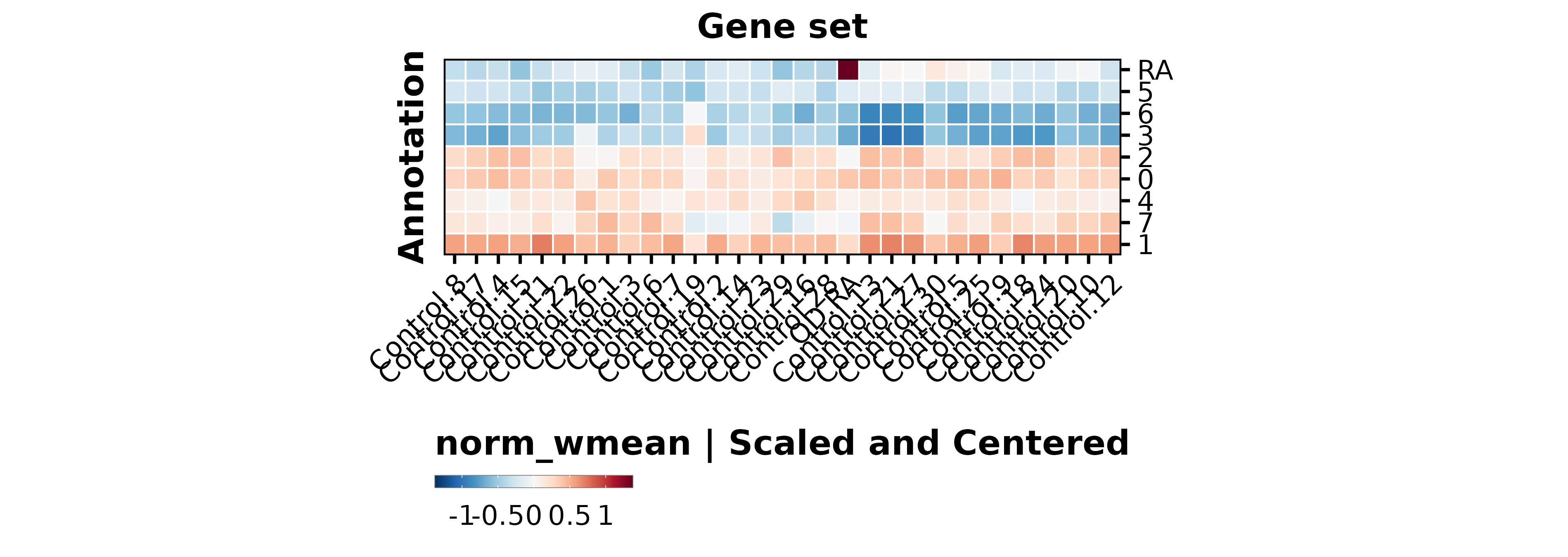
p1<-SCpubr::do_DimPlot(sample, group.by ="labelling", font.size =20, label =TRUE, repel =TRUE, legend.position ="none", raster =TRUE, raster.dpi =2048, pt.size =4, colors.use =cluster_cols, legend.icon.size =8, legend.ncol =3)p2<-ggplot2::ggplot(dist.test, mapping =ggplot2::aes(x =.data$OD_RA))+ggplot2::geom_histogram(bins =100, color ="black", fill ="steelblue")+ggplot2::geom_vline(xintercept =value.use, color ="black")+ggpubr::theme_pubr(base_size =20)+ggplot2::xlab("Enrichment scores for RE metaprogram")+ggplot2::ylab("Number of cells")+ggplot2::labs(title ="Suva OD | Shapiro test | OD_RE ", subtitle =paste0("p value = ", format(stats::shapiro.test(dist.test$OD_RA)$p.value, scientific =FALSE)," | Value so that P(X > Value) = 0.05: ",round(value.use, 4)))out<-SCpubr::do_AffinityAnalysisPlot(sample =sample, input_gene_list =markers.use, assay ="SCT", slot ="data", min.cutoff =NA, max.cutoff =2, subsample =NA, group.by ="Annotation", return_object =TRUE, font.size =20, axis.text.face ="plain", legend.length =8, legend.width =0.5, legend.framecolor ="grey50", legend.tickcolor ="white", legend.framewidth =0.2, legend.tickwidth =0.2,)p3<-out$Heatmapp4<-SCpubr::do_FeaturePlot(sample =sample, features ="OD_RA", font.size =20, raster =TRUE, raster.dpi =2048, pt.size =4, legend.length =8, legend.width =0.5, legend.framecolor ="grey50", legend.tickcolor ="white", legend.framewidth =0.2, legend.tickwidth =0.2, order =TRUE)# Compute dataframe of averaged expression of the genes and bin it.data.avg<-SCpubr:::.GetAssayData(sample =sample, assay ="SCT", slot ="data")%>%Matrix::rowMeans()%>%as.data.frame()%>%dplyr::arrange(.data$.)data.avg<-data.avg%>%dplyr::mutate("rnorm"=stats::rnorm(n =nrow(data.avg))/1e30)%>%dplyr::mutate("values.use"=.data$.+.data$rnorm)# Produce the expression bins.bins<-ggplot2::cut_number(x =data.avg%>%dplyr::pull(.data$values.use)%>%as.numeric(), n =24, labels =FALSE, right =FALSE)data.avg$bin<-binsgeneset_list<-list()geneset_list[["OD_RA"]]<-markers.use[["OD_RA"]]# Method extracted and adapted from Seurat::AddModuleScore: https://github.com/satijalab/seurat/blob/master/R/utilities.R#L272# Get the bin in which the list of genes is averagely placed.empiric_bin<-data.avg%>%tibble::rownames_to_column(var ="gene")%>%dplyr::filter(.data$gene%in%geneset_list[["OD_RA"]])%>%dplyr::pull(.data$bin)# Generate 50 randomized control gene sets.for(iinseq_len(length(geneset_list[["OD_RA"]]))){control_genes<-NULLfor(bininunique(empiric_bin)){control.use<-data.avg%>%tibble::rownames_to_column(var ="gene")%>%dplyr::filter(!(.data$gene%in%geneset_list[["OD_RA"]]))%>%dplyr::filter(.data$bin==.env$bin)%>%dplyr::pull(.data$gene)%>%sample(size =sum(empiric_bin==bin), replace =FALSE)control_genes<-append(control_genes, control.use)}geneset_list[[paste0("Control.", i)]]<-control_genes}out<-SCpubr::do_AffinityAnalysisPlot(sample =sample, input_gene_list =geneset_list, assay ="SCT", slot ="data", min.cutoff =NA, subsample =NA, group.by ="Annotation", return_object =TRUE, font.size =20, verbose =TRUE, axis.text.face ="plain", legend.length =8, legend.width =0.5, legend.framecolor ="grey50", legend.tickcolor ="white", legend.framewidth =0.2, legend.tickwidth =0.2, flip =TRUE)p5<-out$Heatmap+ggplot2::labs(x ="Gene set")+ggplot2::theme(axis.title.y.left =ggplot2::element_text(hjust =0.5))